Extra features are a nice thing to have, but give me a great-feeling switch any day of the week.
(Image credit: Future)
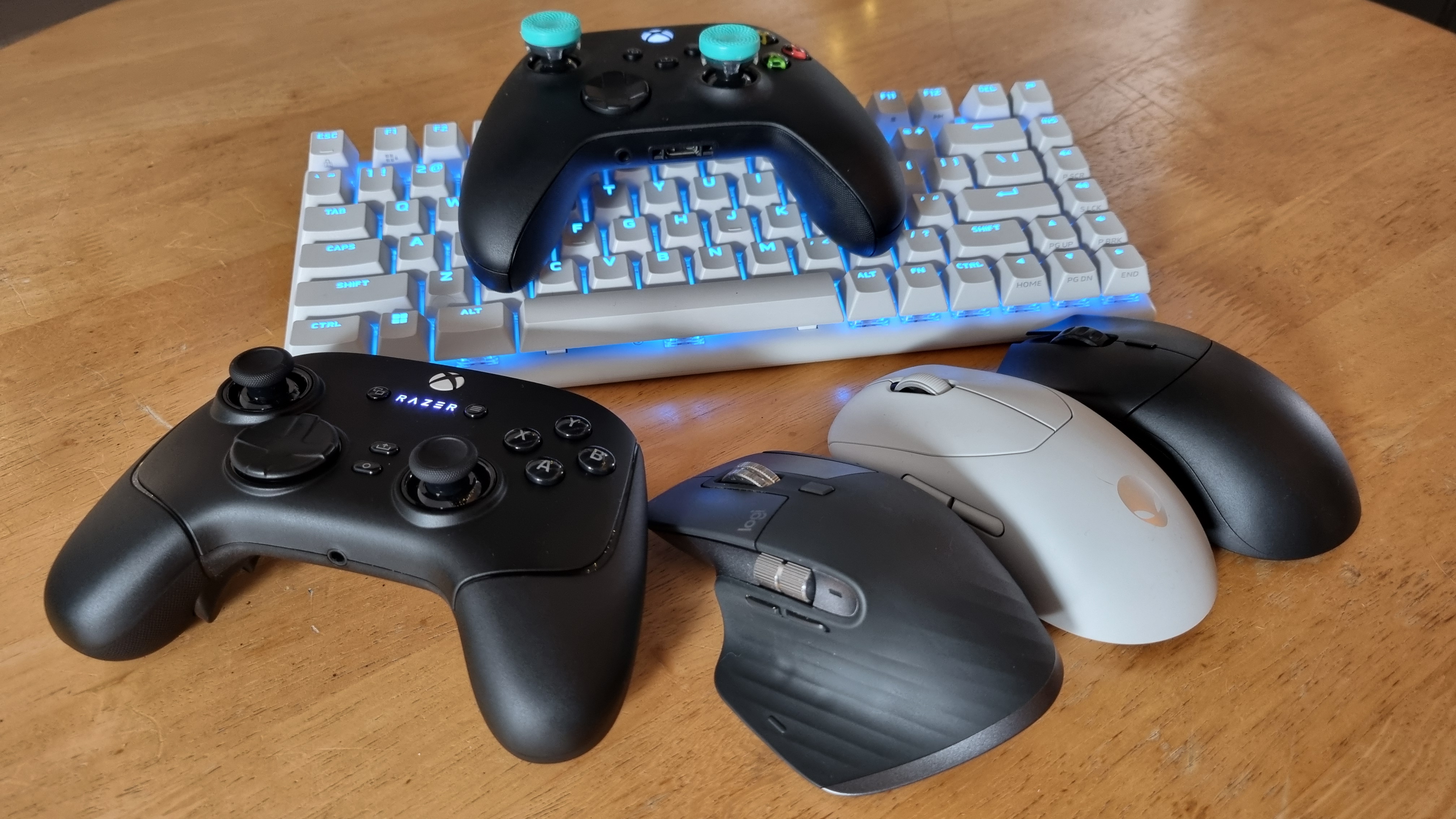
This month I’ve been testing: Keyboards, headphones, controllers and mice. Oh, I’ve also fallen into an all-consuming Satisfactory obsession, from which my brain has struggled to return. A good chance to test out some peripherals, though—and the limits of my patience at the same time.
If you’re looking for a new gaming peripheral, be that a controller, joystick, mouse or keyboard, it can be easy to become bogged down in the spec sheets. After all, you’re likely to be looking for the best bang for your buck, and as a result, there’s a slew of peripherals available that throw the kitchen sink at you in terms of extra features. Keyboards and controllers with dubiously useful screens. Mice with trick scroll wheels. Flight sticks with, well, every sort of switchgear imaginable bolted to the controls.
Your mileage here will vary, of course. Perhaps all those features will come in handy, although most of the time I would argue that you’ll find yourself forgetting they exist. Because in my experience, what really matters in a gaming peripheral comes down to one word: Feel.
I was reminded of this recently upon unboxing the Razer Wolverine V3 Pro. It’s certainly not short on features. You get four rear back paddles, two “claw grip” bumpers, and a pair of lockable triggers that can be switched between a traditional trigger pull and a clicky switch mechanism with a pair of slidable toggles on the rear of the device. And the now-default selection of face buttons, naturally.
All this would matter not a jot if this impressive array of controls didn’t feel good. Oh, but what lovely, satisfying things they are. In fact, most of the main switches on the Wolverine V3 Pro seem designed to elicit a gut-level response upon first press.
Those sliding locks have a sublimely well-weighted chunk to them, along with a perceptible sensation from inside the controller that tells you a heavy spring has been engaged, or released. The face buttons have Razer’s mecha-tactile switches behind them, lending the feel of a clicky microswitch with the cushioning of a rubber membrane.
(Image credit: Future)
(Image credit: Future)
(Image credit: Future)
And this isn’t just me falling victim to the ad copy on the product page. I didn’t know much about the Wolverine V3 Pro when I pulled it from its box, but I knew what I felt when I first ran my hands over its controls. And, truth be told, it activated something in my lizard brain, some deep, primal instinct that told me that what I was holding was a lovely thing. Had I paid for it, like some common, non-hardware reviewing pleb (kidding, we have to give this stuff back), I’d be immediately pleased with my purchase.
I’ll let you wait for the full review to find out what we think about the Wolverine V3 Pro in action, because I’m a tease like that. But the point is, our games exist digitally. We interface with them via these mechanisms, these touchy-feely devices, and (short of something direct, like a good racing wheel), these plastic switches and clicky mechanisms are the only things giving us meaningful tactile feedback.
A good mechanism, in a well-designed peripheral, is the link between the real world and the imagined. This means that when I come across a bad one, it always leaves me scratching my head as to how on Earth it made it out of testing and into the hands of gamers at large.
There’s an obvious caveat to this, so let’s get it out of the way right here: some products are developed and manufactured on a tight budget, and as a result, sacrifices need to be made. A $30 controller with a mushy D-Pad, or a $20 mouse that feels a bit too plasticky to be trusted, is an understandable thing. A mistake regardless, I would argue, as there are many brilliant cheap controllers with half-decent D-Pads, and many ultra-light and ultra-cheap mice that still feel well-made. Still, a tight budget is a relatively understandable reason for a poor tactile experience.
(Image credit: Andy Edser)
But when you find an expensive product with an awful feel, it really grinds my gears—sometimes quite literally. Enter, the Hori HOTAS. This is a flight stick and throttle control system currently available for $500, which really isn’t cheap. It’s also covered in buttons, toggle switches, clicky hats and paddles, many of which feel very good indeed.
The twin throttle control action, however, is entirely unacceptable. This is a movement that should, when implemented correctly, put the powerful engines of your digital plane directly beneath your arm movements. It should deliver weight and substance. It should feel like you’re powering up the engines on a real, immensely exciting plane.
…you’ll see us using words like crunchy, chunky, clicky, clacky, or thwock, thwap and zing.
What it shouldn’t feel like, is dragging a piece of cheap plastic over sandpaper. Nor should it sound like it, for that matter, which is exactly what the Hori HOTAS system manages to achieve.
There’s still a lot to like about the Hori units. But for every great-feeling control, there’s another hollow, sticky, rattly one seemingly hell-bent on ruining the overall experience. For some reason unbeknown to man or beast, many of these awful controls are the ones you’ll end up using most often.
As a result? Anybody who buys a set is likely to be disappointed the second they’re pulled from the box. And that simply isn’t good enough. Tactility in a peripheral might not quite be everything, but it makes up such a huge percentage of the experience that sometimes it feels like it may as well be.
(Image credit: Future)
And don’t even get me started on keyboard switches. Here, I’m a relative newb, but having had the pleasure of hanging out with and learning from the keyboard enthusiast community (and it genuinely has been a pleasure), I can tell you that they take switches about as seriously as their mortgage payments. And having used some of the best myself, I can say with confidence: I kinda get it.
I use my keyboard every day, for hours on end. Like many of you, I’m sure. The difference between a good key action and a bad one matters if it’s what you’re going to be interacting with for millions of keypresses over its lifetime. Again, tactility is all.
The real issue is that there aren’t many real-world stores left anymore where you can go and get your hands on this sort of stuff for yourself. Which means you’ll be relying on reviews to tell you what feels good and what doesn’t before you lay down your cash, written by people like me.
That’ll also be why you’ll see us using words like crunchy, chunky, clicky, clacky, or thwock, thwap and zing. Onomatopoeic terms, all used to try and get some sort of touchy-feely sensation across through the medium of words, innit.
We do our best, at least. So when it comes to your next peripheral purchase, by all means, size up the features, price, and all the other things that’ll help guide you to spend your money wisely. But if I were you, it’s the tactile stuff I’d really pay attention to. The clicks, the clunks, the clacks. That’s the thing that really makes the difference, in my book.


