Swedish esports organisation Alliance unveils rebrand
Image credit: Alliance
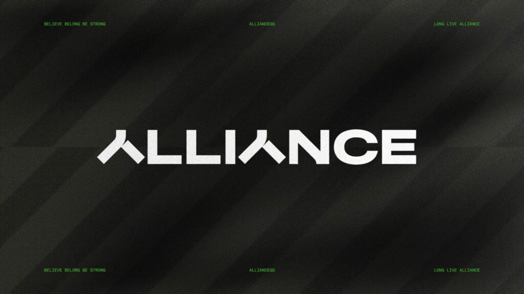
Swedish esports organisation Alliance has revamped its visual identity, including a new logo and overall design language.
The new branding will roll out across all of the company’s assets in multiple regions. The logo will remain a stylised letter A, but the overall design is more in line with a simplistic style that many in esports have adopted. The main colour is bright green, but white and grey are also used.
Esports Around The World: Sweden
Alliance teams up with Redd+E
India’s Maharashtra Government awards Asian Games 2022 esports athletes with prize money
Alliance is a Swedish esports organisation most known for its success in Dota 2. Alliance won The International, Dota 2’s top tournament, back in 2013 and was a steady performer in the Dota 2 scene before disbanding in late 2023. Alliance also had rosters in several other games, including PUBG Mobile and VALORANT, but currently only operates teams in CS2 and Apex Legends.
The company’s new brand is a strong contrast to its original logo, which was adopted almost a decade ago. While both logos have a stylised letter A, the old one has a stronger cartoon or comic book inspiration. Meanwhile, the new design is more flat and abstract with a much bolder colour.
Interestingly, the colour palette is similar to the rebrand of another Swedish brand, Ninjas in Pyjamas, which also opted to go for bright green as one of its main colours when the organisation rebranded in 2021.
The palette of former UK esports organisation EXCEL ESPORTS was also heavily angled towards a similar shade of neon green. In South America, LOUD also prefers the same colour for its branding.
The company worked with design firm Kurppa Hosk, and describes the new brand as “a bridge between East and West, a home where Alliance combined a multitude of cultures in work and play over the last decade.”
Alliance also shared that the logo “marks the beginning of a new chapter in its journey, one filled with curiosity, growth and continued prosperity.”
