Logo redesigns can be costly, and for a company the size of Google? The mind boggles.
Stop the presses, shutter your blinds, and cancel your weekend plans—Google’s just changed its logo. It’s changed its logo for the first time in 10 years. This is huge news in the world of marketing and branding. What, one wonders, is this tectonic shift to the face of one of the world’s biggest tech companies? What new facet of design might trend-set the logos of the world for the next decade?
Someone hit it with a Gaussian blur, basically.
As reported by The Verge, Google is rolling out this change piecemeal—starting with updates to Google app on IOS and Pixel phones, and likely coming to a search engine near you. In fact, the only search engine you likely use.
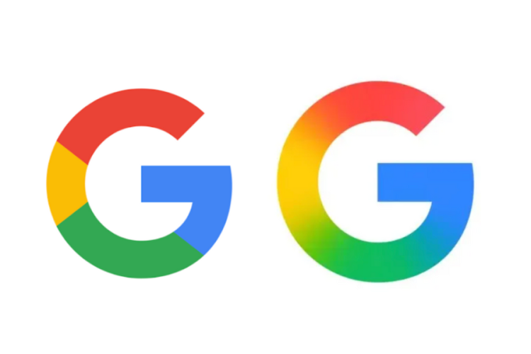
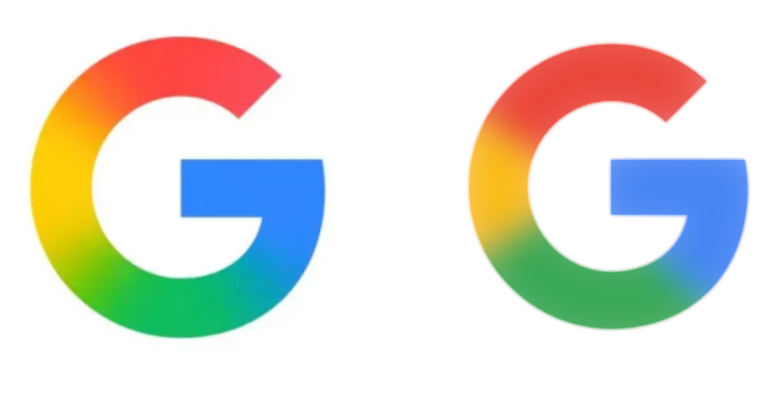
The change is, to put it politely, minimalist. When I say “just hit it with a Gaussian blur”, I’m exaggerating a little, but not much. I double-checked with my non-colour-blind colleagues after doing this, but I popped the old logo into some photo-editing software and hit it with the Gaussian blur tool just to see if my instinct was right. Google’s new logo is on the left, the one I edited is on the right.
It’s dang close. The actual logo has a little more yellow in it, and said yellow yaws a little closer to the orange spectrum of light—which might be because my blurring made the original G a smidge transparent, something I solved by duplicating the layer a lot and merging it all together.
Which leads me to a very funny conclusion: This might be the most expensive Gaussian blur in history. Brand redesigns, no matter how small, are incredibly costly. Here’s a shortlist I gathered just by doing a bit of (and the irony is not lost on me) googling:
In 2022, the BBC spent £7 million on its rebranding, a fact that had to be wrung out of them during an “eight month freedom of information battle”. British Petroleum came under fire in 2000 for a logo redesign that reportedly cost £4.6 million (and another £132 million to rebrand “its stationery, van liveries and manufacturing plants”).
The most egregious example is when, in 2008, Pepsi apparently spent one million on a logo redesign that moved the red and blue lines of the logo slightly. This was revealed years later in what I can only describe as the funniest leaked document I’ve ever set eyes on. At one point, it compares the Pepsi logo to the Earth’s magnetic field. The words “Pepsi Energy Fields” are on an official document from the Pepsi company circa 2008, and I am not kidding.
How much did Google’s redesign cost? I have no clue, and unless the company releases the numbers itself, we’ll never find out. But we can safely assume given both the scale of Google’s operations and the historical precedence that it was a lot. It was a lot of money.
Anyway, I’m not interested in dunking on the team of graphic designers who undoubtedly put a lot of hard thought and work into Google’s new logo. They’re operating on levels of awareness of both design theory and marketing know-how that are unfathomable to me. Redesigns like this are expensive because they include rounds upon rounds of design, constant talks, iterations, focus group testing, research, and so on. It’s a whole operation.
But you’ve gotta admit, it’s a little astonishing. Hypothetical millions spent to, well, make the G a little blurrier. Wonders will never cease.
2025 games: This year’s upcoming releases
Best PC games: Our all-time favorites
Free PC games: Freebie fest
Best FPS games: Finest gunplay
Best RPGs: Grand adventures
Best co-op games: Better together
