"A great example of how Valve dysfunctionally works but works well."
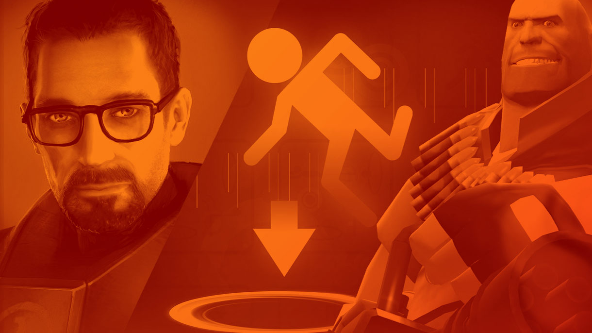
On October 10 2007 Valve released what is perhaps the greatest deal in gaming history: The Orange Box, a compendium of Half-Life 2 with both episodes, the long-awaited Team Fortress 2, and the unknown quantity Portal. OK, Half-Life 2 was a few years old by this point (Episode 2 was new), but every single game in that package is an all-timer, and you got the lot for the price of one retail game.
And at the time, retail still mattered to Valve: Steam was a few years old, but boxed sales were the focus for The Orange Box at launch. Which naturally made the box itself a very important part of the whole deal and… well, this is the one aspect on which The Orange Box fell flat. The final product was a weird tripartite presentation of all three games, which have distinct aesthetics, and a bunch of text telling you what was in the box.
Luckily for Valve the contents were so special that an ugly cover didn’t matter much, but The Orange Box ended up here after an initial pitch that came from a totally different direction. It was so different, in fact, that it inspired a minor revolt.
“I don’t normally talk about non-public things at Valve,” says former Valve writer Chet Faliszek, “but that person’s gone now and this was the funniest thing to me and a great example of how Valve dysfunctionally works but works well.
“Half-Life 2: Episode 1 comes out and it doesn’t set the world on fire, it does OK. Half-Life 2: Episode 2 we’re working on, early days of TF2, Portal.” Faliszek chuckles recalling how some corners of the internet perceived Portal in particular: “Go back and look at the early days before the Orange Box came out, like ‘They’re throwing in this student project, it’s gonna be crap.’ It’s crazy. Even then we knew ‘Oh this is special, you guys are gonna eat those words.'”
To return to the box, it comes down to an internal meeting which is “a great example of how decisions get made,” says Faliszek. “Going into the meeting the box is the most important thing possible because it’s going to talk about the game on the store shelves. We’re not even trusting Steam yet, this is like 2007. The box is gonna be the most important thing, and you have to convey value in the box. Everyone who worked there back in the day will remember this meeting because they show this box and… it’s like an Apple box, it’s got nothing on it, except [whispers] ‘Half-Life 2’ or maybe ‘The Orange Box.'”
I’m imagining this as some sort of Valve spin on The Beatles, better-known as the White Album, which came in a plain white sleeve with the band’s name embossed on it in small type. But I guess the difference there is that the Beatles in 1968 didn’t need to worry about whether their new album would sell at retail. Either way Valve staff’s opposition to the idea mounted.
“There was The White Box, The Black Box too, it was super-confusing,” says Faliszek. “But it was so stately and so beautiful and we were all like ‘this is stupid, this is just dumb,’ and these were senior people pitching this, and oh my god the ridicule they’re getting for this idea, this game box… and it does look like nothing else, but…
“Everybody who’s been working and crunching, this is our relief valve, I’m using a bunch of puns here, our way to blow off steam and get this out of our system. That box… man I wish I had it, any of the art from that I’d love to see it again because it makes me laugh. Peoples’ hearts were in the right place, they were trying something, you know you talk yourself into it. But then it meets reality and the first playtesters for anything are always other people at Valve… and that got destroyed.”
Faliszek admits that where Valve ultimately ended up wasn’t ideal, but “the box for the Orange Box is not a good box because it’s an impossible problem to solve.” Which is a fair point, though he adds that the company’s issues here were something it learned from and, shortly afterwards, they did a much better job of selling Left 4 Dead’s concept with the box art.
Oh and as for the name, well, that’s just the way Valve rolls. “It’s the Orange Box because Valve’s always just used the colour orange for the Half-Life series,” says Faliszek. “I’m a big fan of the colour orange so I really liked it.” But now you know why it didn’t come in a white box.


