Sometimes we suffer for our craft.
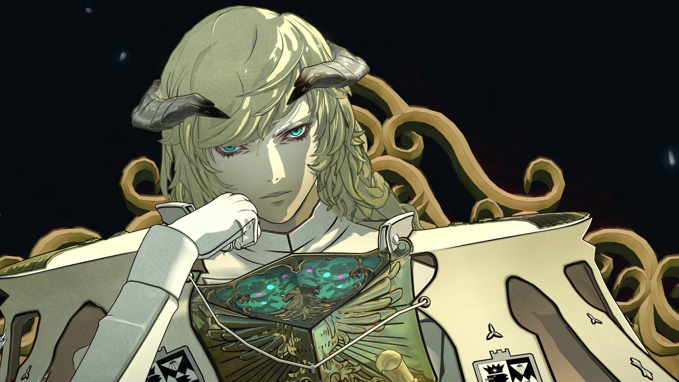
Atlus RPGs mean bold aesthetic decisions, and that includes the studio’s menus. Where other games might be content to rely on the proven, dependable rectangle, Atlus’s interfaces are as much modern art as they are menus. They’re arranged at off-kilter angles; they tumble onto the screen as a collage of disparate elements. They might, in the case of Metaphor: ReFantazio, be embellished with runic transcriptions of encoded Esperanto. They’re striking, they’re satisfying, and—according to Persona series director Katsura Hashino—they kinda suck to make.
In an interview with The Verge, Hashino said that—like any game developer—Atlus has to balance aesthetics with usability when designing its menus and interfaces. However, Hashino explained that by having bespoke layouts and interface designs for every menu, the studio’s basically chosen the most difficult version of the balancing act.
“We have unique designs that we make for each and every menu,” Hashino said. “This is actually really annoying to do.”
Even worse, each one of those menus has its own unique software making it work. “We have separate programs running for each of them as well,” Hashino said. “Whether it’s the shop menu or the main menu, when you open them up there’s a whole separate program running and a separate design that goes into making it. It takes a lot of time.”
That process certainly hasn’t gotten any simpler, because Atlus’s menu designs have grown steadily more abstract—a progression that Hashino said hasn’t always gone flawlessly. Apparently, early iterations of Persona 5’s menus were difficult to parse. “It was impossible to read at first,” Hashino said, “so we did lots of tweaking and adjusting so it became legible.”
Sure, Atlus’s designers could just fall back on the faithful rectangle, but I can’t imagine it’d be a better world if there were fewer artists following their unnecessarily complex visions. At the very least, I guarantee it’d be a world with a lot less glyphic Esperanto.