Ubisoft throws a wrench into the yellow paint debate with "Explorer Mode."
Of all the cyclical videogame debates that crop up on social media, few get me as riled up as whether or not developers should be painting objects yellow. Making interactable objects more noticeable by painting them a distinct color isn’t a new thing for games, but the specific trend of choosing bright yellow streaks to signpost anything and everything—doorways, breakable boxes, levers, ledges, rocks—has awakened a backlash from some who believe this level of handholding works against games by stealing opportunities for players to discover things on their own.
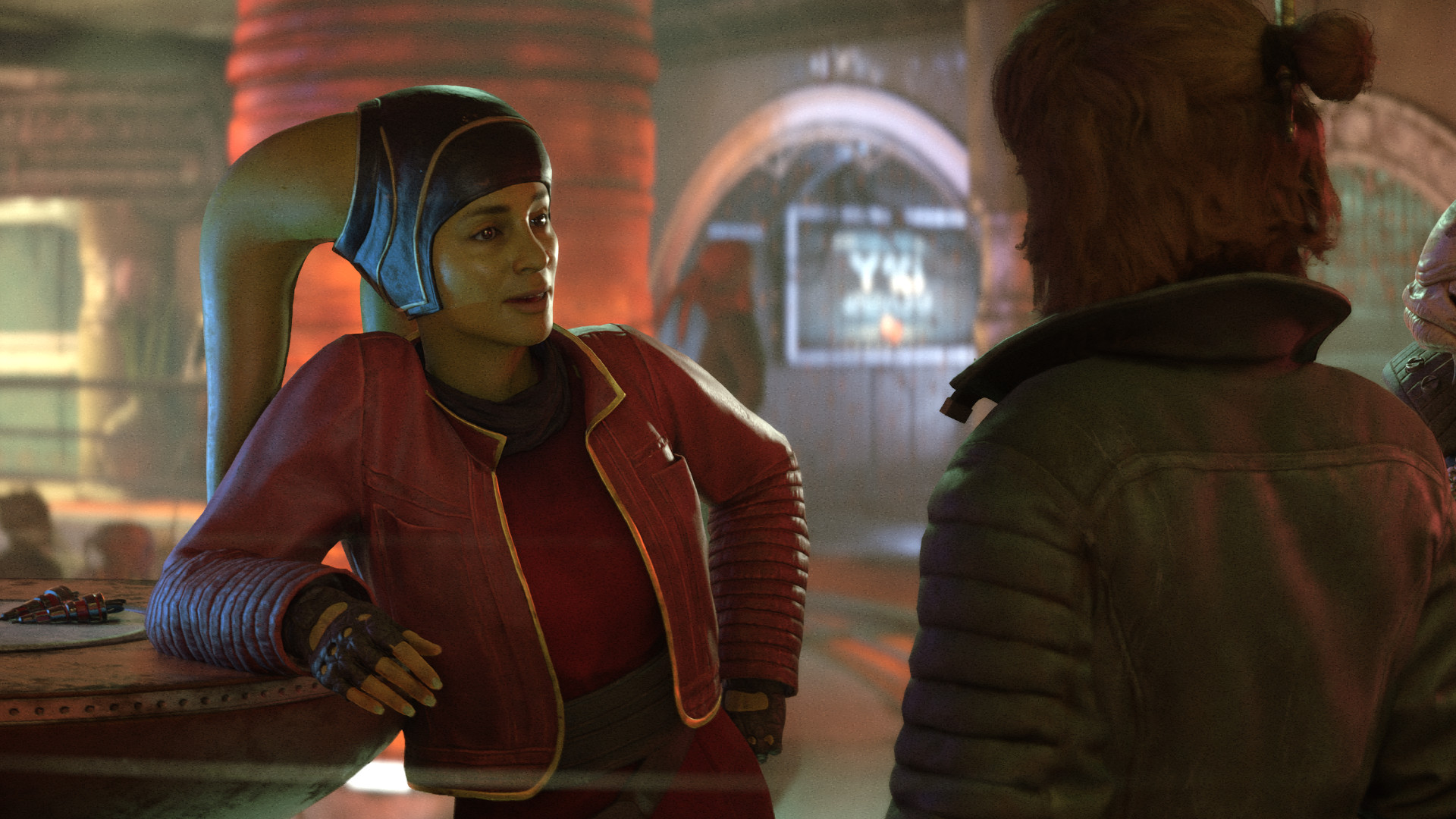
While developers are often quick to counter this feedback by reminding players that yellow paint is the result of testers getting lost in early playtests, Ubisoft Massive has come up with an interesting workaround for its upcoming Star Wars Outlaws that just might make both camps happy: an “Explorer Mode” that turns off the “guiding color on core navigational elements” in the world. In other words: a yellow paint toggle.
I tried to give the mode a spin during an extended Outlaws preview session in July, but I didn’t notice a difference after turning it on. An Ubi rep eventually told me that the mode wasn’t active in the early build I was playing. Bummer.
I’ll surely be flipping Explorer Mode on in the final version, because by default, Star Wars Outlaws has more paint than a yellow brick road. The “guiding color” was most prevalent during Uncharted-like climbing sequences and puzzles. Yellow paint was lathered on walls of climbable steel, critical path ledges that were already obvious before their paint job, and streaked above ventilation shafts to ensure I couldn’t miss them. Of course, one of the joys of non-linear stealth games is finding stuff that you genuinely could have missed—a well-hidden sewer grate, trap door, revolving bookshelf—so all this really did was make Outlaws’ stealth bits less fun.
Ditching yellow paint might have some annoying consequences. Once I turn off signposting, I fully I expect to jump toward a wall or two that aren’t actually climbable and fall to my death (I actually did this once in my demo without Explorer Mode). But is that bad game design? After falling once, I had a better understanding of what can and cannot be climbed in Outlaws and didn’t misjump again. To play a new game is to learn its language. I’m oversimplifying, but I think the yellow paint conversation is connected to the fact that most videogames don’t consider “searching” to be a skill anymore. Any time spent scanning a room for a ladder, pipe, or moveable box isn’t treated like interesting gameplay, but needless friction getting in the way of the next shootout or puzzle.
Signposting isn’t an all-or-nothing practice, either. Yellow paint catches deserving flak for being unsubtle and ugly, but good art direction can accomplish the same thing in a fashion that nobody will complain about. The Half-Life and Portal games had a knack for guiding our eyes toward important landmarks with lights, props, and sounds while making us feel smart for finding them. Ubisoft doesn’t even have to look outside the Star Wars franchise for inspiration. Last year’s Star Wars Jedi: Survivor established a simple visual language for where Cal Kestis can and can’t go: grated metal with round holes means Cal can climb, and walls with horizontal scratches, cracks, or divots indicate a wallrun.
But if Outlaws is rolling with yellow paint as its guidance tool of choice, I’m glad Ubi will at least let me turn it off. Please do this, other games. Star Wars Outlaws is out on August 30, just a month away now. I played a big chunk of it and, annoying paint aside, I had a blast.

