This PC-98 classic presaged Resident Evil by adding action and horror to the dungeon crawler.
Pasokon Retro is our regular look back at the early years of Japanese PC gaming, encompassing everything from specialist ’80s computers to the happy days of Windows XP.
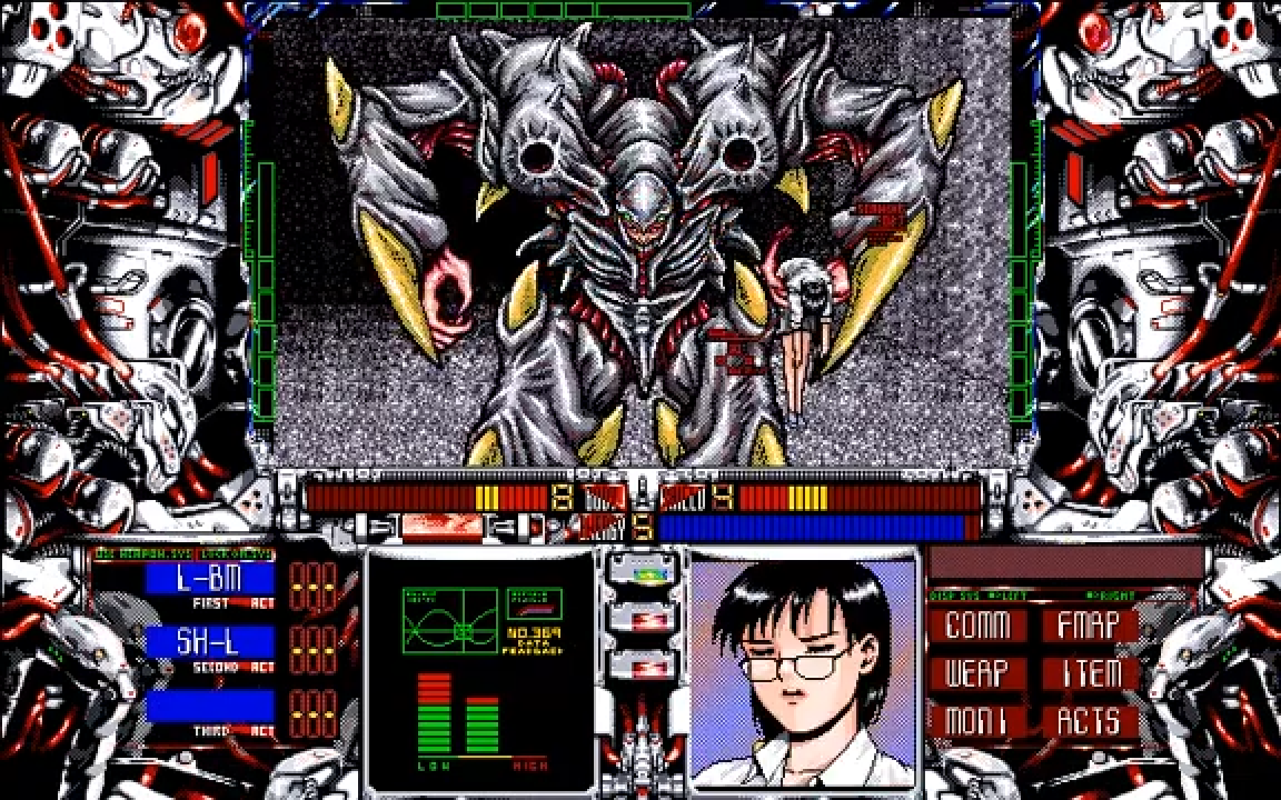
At a glance Hamlet looks like just another dungeon crawler to add to the already enormous ’90s pile. There’s the screen-clogging UI. There’s the crude first-person view. There’s a bunch of stats, menus, and equipment with AWK ENG ABBRV endemic to the genre because there just wasn’t the space for anything longer. I may as well dust off my graph paper and get stuck in.
Developer: Panther Software Released: 1993 Japanese PCs: PC-98 (Image credit: Panther Software, Obscure Game Aesthetics)
But anything longer than a glance shows just how ambitious and innovative this game is. This is a free roaming, true 3D, survival horror-tinged mech adventure running on a line of computers that under normal circumstances would expect me to wait politely for a large spreadsheet stored on a floppy disc to load. Here I am the newest member of a small team sent to find out why Hamlet, the titular moon facility that definitely hasn’t been doing any sort of dubious research, isn’t responding to any outside communications. I have to scavenge for repair kits and armour, pick up vital information left lying around by the dead, and use any guns I find sparingly, because every shot counts. I may have access to everything from laser guns to rocket launchers, but I’ve never felt more vulnerable.
A steady stream of unprompted radio chatter and unexpected events keep me on edge. This is not the sort of game where nothing happens until I press a switch or open a door: this is a dangerous location that’s being actively investigated by the other members of my team, somewhere that isn’t going to wait for me to get ready before it starts fighting back.
The primitive rendering of my lunar environment actually enhances the mood. A game that takes place inside an eerily lifeless moon facility should look dark, grainy, and intimidating. It should be impossible to see way off into the distance. Much like Silent Hill’s fog, Hamlet’s look is so closely tied to the setting it becomes part of the experience itself.
And as coarse as it looks, there’s a lot of detail packed into every room. The opening shuttle bay area is a cavernous structure housing several large spacecraft, one of which has its back hatch open, its (simple) interior waiting to be explored. Large struts and beams melt away into the inky shadows overhead, and a large ramp leads upwards to a narrow walkway where a short wall hems me in on one side. Elsewhere pipes and metal grills frequently decorate the game’s corridors, floors may have deep holes cut into them, and hatches open in a needlessly complex manner. Nobody would’ve been surprised if this had been another game filled with endless right-angled labyrinths, but right from the start Hamlet wants me to see service ducts and deserted passageways, to treat this as a once-functional facility that has fallen suspiciously silent.
I have to navigate these areas using nothing but my mouse, clicking on various parts of the screen’s main display to make my mecha—a VF, short for Variable Formula—walk forwards, backwards, strafe, or turn to the side. It felt pretty unnatural at first, but just like the nigh-monochrome view ahead this unusual restriction brought with it a lot of flavour. Piloting a giant stompy mech through hostile territory should feel a little awkward for a newbie, shouldn’t it?
I stopped being a newbie a few hours later when I finally understood why Panther Software had gone with the strange control scheme. It’s a really comfortable way to move: I only have to hold my LMB to walk around, and gently knock my mouse to the side to turn while still moving forwards, or briefly nudge the cursor a little lower if I want to step to the side. I’d be happy if modern adventures included something like this.
(Image credit: Panther Software)
(Image credit: Panther Software)
(Image credit: Panther Software)
(Image credit: Panther Software)
(Image credit: Panther Software)
(Image credit: Panther Software)
(Image credit: Panther Software)
Interacting with the buttons in my VF’s cockpit is similarly restrictive, this time the mouse playing the role of my virtual finger. I love immersive touches like this. I’m not sitting in front of my PC any more, I’m inside my VF, manually pressing buttons to call my team, switch one of my interior monitors over to a very handy minimap, or changing the mecha’s form between three different Macross-inspired battle modes.
The incredible thing is that the first-person view doesn’t just do a fun little screen bob in between these physical shifts—it actually settles closer to the ground when I’m smoothly darting around in Cruise Mode’s high speed form, Combat Mode has a distinctive visual thump to its walk, and the Assault Mode that sits between them has a unique exaggerated lean when it turns.
Naturally any abandoned facility worth exploring for dark secrets is teeming with high tech security and a few strange monsters. These enemies (as well as friends, items, and objects of interest) appear not as crude shapes roaming in the gloom but as a proximity warning on my VF’s HUD, the colours becoming more intense the closer I get. When they do finally show up the sprites are often large and always show lots of fine detail, this contrast with their environment giving them a macabre sort of extreme focus: the most complex things I’ll ever see in Hamlet will probably kill me.
And they’ll do it quickly too, as these battles take place in real time and my own reactions matter even more so than the games RPG-lite stat system. I have to manually block incoming fire with my own mouse-controlled shield, or switch to a weapon I then have to manually aim at a moving or maybe even shielded target, hoping I hit them because there’s a short recharge period after each shot that’ll force me to adjust my aim, change my priorities, or both.
It’s a huge, exciting, and almost arcade-like shift away from the “Click attack to play the same old sword swing animation again” and “Party Member 1 > Weapon A> Monster 2” scenarios usually found in the genre.
Hamlet’s an irresistible mix of the unsettling and exciting, so much so that bar some changes to its presentation (for the worse, in my opinion), it made the leap to PlayStation and later the Dreamcast with its core concepts and general design work almost untouched, to the point where even vital passcodes remained unchanged. This game turns every perceived weakness, from its button-heavy interface to its poor draw distance, into a strength. It still feels like a unique twist on the survival horror genre, even though it was released years before Resident Evil coined the term.
A game as good as this deserves its day in the sun, not left abandoned on the dark side of the moon.


