Misguided changes to the visuals, cutscenes, and story make this a deeply disappointing release that's simply worse than its predecessor.
It’s hard not to be sceptical when a full remake is announced for a game that’s only a decade old—doubly so when the original is still accessible and holds up well. So I can’t say I went into Brothers: A Tale of Two Sons Remake with an entirely open mind, but even still I think it’s a profoundly disappointing release.
When Brothers: A Tale of Two Sons first released, it was one of those amazing out-of-nowhere surprises—a beautifully told story of two boys on a quest through a whimsical world to save their dying father. Its mechanical twist—you control both brothers simultaneously, each having their own thumbstick and trigger—still feels innovative and unique today. The control scheme and the narrative weave together wonderfully as each boy’s personalities, strengths, and fears are expressed, culminating in an emotional and surprising finale that pays off both to sublime effect.
It’s an interesting contrast to developer Josef Fares’ later work—where A Way Out and It Takes Two are both interested in experimenting with what’s possible in a two-player experience, Brothers essentially asks you to play co-op with yourself. Its story, told visually without any intelligible dialogue, feels simpler but more nuanced and affecting than Fares’ more dialogue-heavy later works.
Of course, Fares had nothing to do with this remake—he directed the original game at Starbreeze before his own studio had been founded, and Starbreeze subsequently sold it to 505 Games, who’ve since been putting out ports to various consoles. It’s not unusual for the original creator to not be involved in a remake these days, but in this case it is particularly evident—Brothers: A Tale of Two Sons Remake hardly seems to understand the intent of its predecessor, let alone how it might improve on it. Despite a decade of technological progress, this release represents an insultingly worse experience.
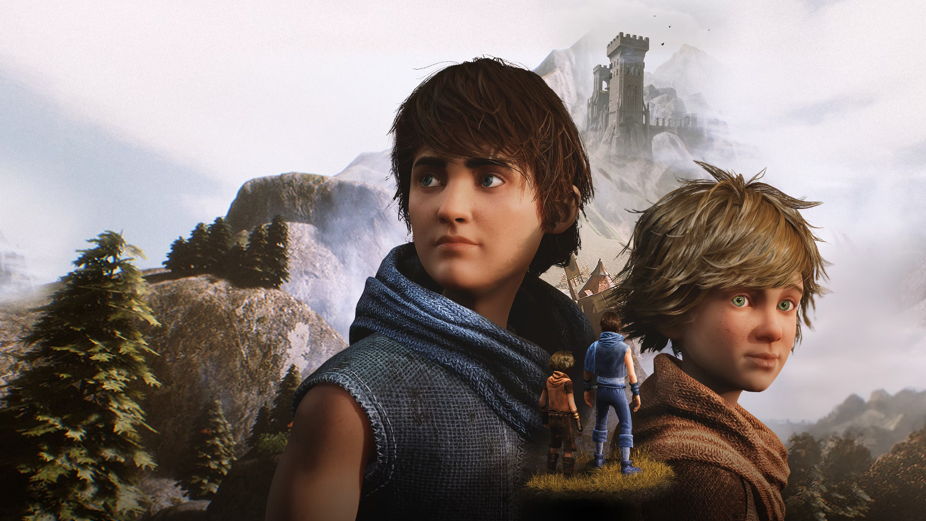
The visuals are the most noticeable difference. The artstyle of the original is warm and colourful—it evokes the feel of an old children’s picture book, and though the character models are noticeably chunky to modern eyes, it’s still often strikingly beautiful. The remake chucks that out the window, opting for a more realistic look that bulldozes the cosy atmosphere and evokes nothing but ancient Unreal tech demos.
An early scene from the remake. (Image credit: Avantgarden SRL)
The same scene in the original game. (Image credit: Starbreeze Studios)
Characters that originally had the soft friendliness of stuffed dolls now have an off-puttingly plasticky shine. Pastoral scenes that glowed with welcoming orange light are now dark and muddy with smeared details. The once deliberately simple cutscenes have been entirely recut to be moodier and more dramatic, a choice that not only clashes with the fairytale feel of the story, but in many cases totally changes the meaning of important moments.
In the early scene where the brothers learn about their father’s illness, for example, the doctor who originally felt gentle and sympathetic now seems oddly dismissive, and the little brother has become fearful instead of bold. In a story with no dialogue, every movement and facial expression is important to conveying what’s happening. I don’t think it’s holding the original unnecessarily sacred to say that changing them willy-nilly is a misstep that does real damage to the intended narrative.
Even beyond the look and feel of the game, the updated visuals directly impact on the puzzle-solving that makes up the meat of the action. The grimier look makes every scene less readable, and no mind seems to have been paid to why certain objects and items were originally brighter and more noticeable against their backdrop. In the game’s first puzzle, for example, a rope has been changed from off-white to dark brown, making it much more difficult to spot as something important to progress—I wouldn’t be surprised if players get stuck at that early hurdle as a result, before even getting to the more complex obstacles later in the story.
The brothers climbing along a ledge in the remake. (Image credit: Avantgarden SRL)
The same scene in the original game. (Image credit: Starbreeze Studios)
It brings me no joy to come off as some kind of obnoxious purist, but every change here is wrong-headed. The one thing that I think would’ve benefited from an update—the very basic menu UI and in-game text—is the lone element that seems to have been left untouched. Given how wonderfully playable the original still is, it’s difficult to shake the feeling that this is just a quick and dirty way for 505 Games to squeeze more money out of a modern classic with a pretty off-putting disregard for its artistic integrity. There’s no meaningful preservation happening here, beyond I suppose putting a version of the game on current-gen consoles—it reeks of cynical business decisions.
Brothers: A Tale of Two Sons Remake makes one significant addition to the game: it introduces a co-op mode that allows two people to control one brother each. This represents such a profound missing of the point of the original’s unique design that even the developer seems embarrassed by it, flashing up a warning that “the gameplay and story will feel different with two players… singleplayer remains the intended experience”. If only its publisher had had a similar attack of self-awareness about every other misguided change in this utterly soulless remake.
Brothers: A Tale of Two Sons Remake comes out February 28. I can only hope the original doesn’t get pulled off sale when it does.

