A legend wouldn't go amiss.
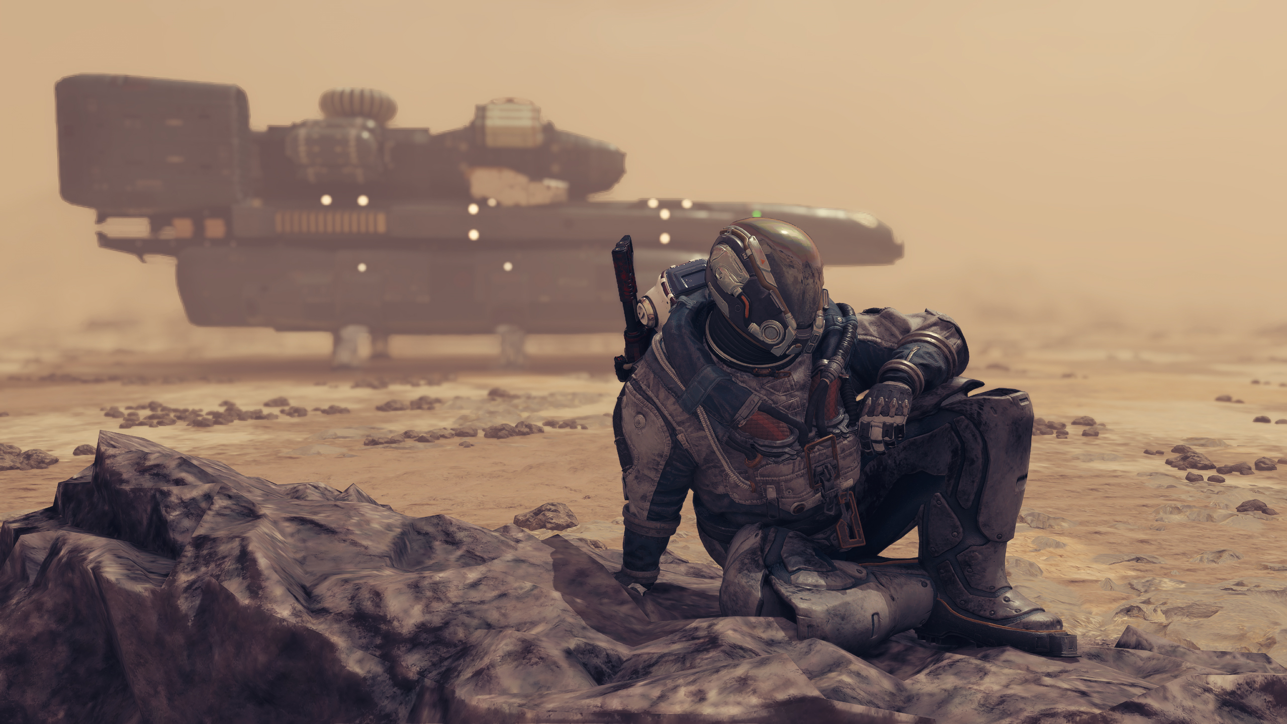
There’s lots of little mechanics that Starfield doesn’t bother to explain. While this is sometimes neat, leading to interesting discoveries from mucking around and finding out, some of it has me tilting my head as to why there wasn’t even like a note or something. Initially spotted on the Starfield Reddit by Gamesradar, user raging_pastafarian gave a helpful rundown of the game’s interstellar map.
I’m level 34 and I JUST realized this about the star map, while trying to visit every star. from r/Starfield
To sum it up—if a star’s glowing, you’ve visited it. If it’s lit up but not glowing, you can jump there, but you haven’t visited it. If it’s red, it’s outside of your normal grav jump range.
The community’s been equally bamboozled, considering the PSA hit around 6,000 upvotes in short order. Granted this sort of thing’s easy to miss—the star map already requires a fair amount of squinting to use properly, and as user nebula— points out: “I was assuming the red meant ‘gonna die here’.”
This is a reasonable assumption, as there’s a correlation with higher-level systems being further away from your starting point. It’s also a reminder of why colour language is a thing in games. Health is typically red, stamina is typically green, magic is typically blue, purple is typically poison—and on maps, red usually means “danger”. Not a problem if your game has a tutorial for it, but if you’re relying on assumptions like Starfield does, it’s an issue.
You could also just have red-green colourblindness like yours truly, and struggle to even make the crimson sods out. Luckily the stars are still visibly dimmer for me, but I do wish devs would signpost this stuff with colour and visible UI differences. This isn’t even a Starfield specific gripe. Baldur’s Gate 3, one of my favourite dang games of the year, still inexplicably turns empty spell slots above the action bar a very light shade of red, which is nearly indistinguishable from white to me.
Whether or not your eyes are broken like mine are, it would’ve been nice to not have to source this info from the community. It’s a neat, intuitive little system when it’s actually laid out to you, and great for completionists who want to explore every corner of Starfield’s final frontier.

