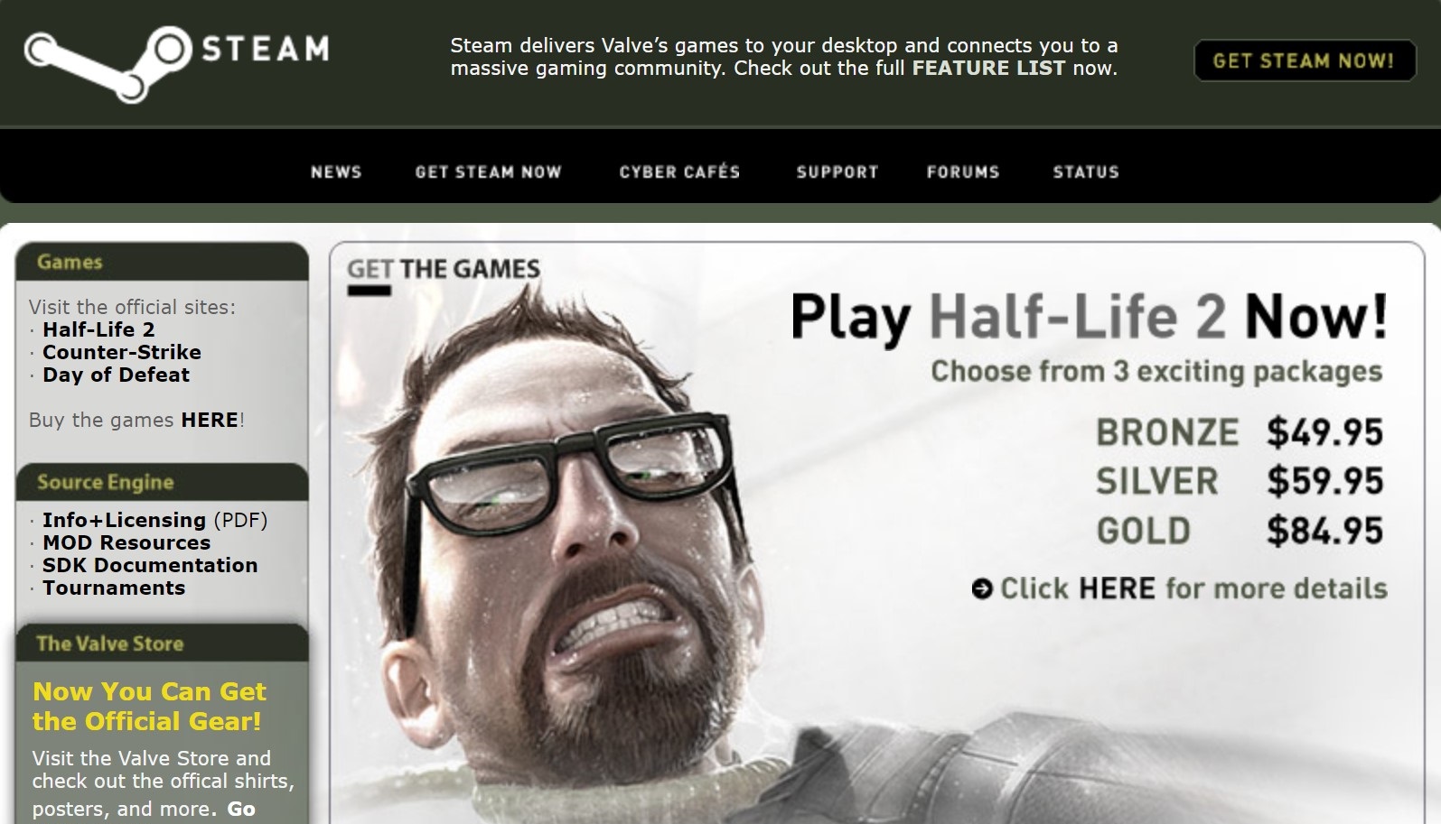
We were so young and innocent in May 2005—Prima was offering Eguides for Valve games, and Counter-Strike: Condition Zero was a whopping $14.95.
A twitter account that catalogs classic interfaces from the history of web browsing, the Web Design Museum, shared a screengrab of the Steam homepage circa May, 2005. This look back at the early days of Valve’s juggernaut set our minds alight, conjuring memories of Day of Defeat Source, surf maps, and custom Half-Life 1 campaigns. Things have come a long way since those olive drab days.
Steam website in 2005#WebDesignHistory #Steam pic.twitter.com/LU4PWzyGZdFebruary 3, 2023
A quick trip on the Wayback Machine can serve up versions of the site from any era of its almost 20-year existence, but I think the Web Design Museum hit a real sweet spot with this ’05 iteration—it’s nowhere near as sparse as our first look at the Steam official site in 2002, but we’ve also yet to see the gleaming grey-and-blue terminator of today start to tear out of its olive drab flesh like in this snapshot from 2006.
My eye was immediately drawn to the bronze/silver/gold editions of Half-Life 2—at the risk of revealing myself to be a pathetic bronze-tier gamer, I had no idea what these gradations meant at first. Honestly, the $85 gold edition of HL2 seems to have been pretty sick.
According to MobyGames, you got downloads of Half-Life 2, Deathmatch, CS: Source, Half-Life 1 Source, Day of Defeat Source, and a “back catalog” of Valve games—presumably the original GoldSrc Half-Life and its expansions? The pack also included a physical box mailed to you with a strategy guide, posters, and other classic swag bag fare. Beats a digital deluxe edition with a DLC pass, I reckon.
My heart was also filled with yearning and nostalgia on seeing the Half-Life 2: Raising the Bar art book over on the sidebar. I remember absolutely poring over that thing for hours back in middle school, and it offers some tantalizing glimpses of alternate designs for iconic enemies and areas.
Counter-Strike: Condition Zero and Prima “Eguides” were a real hoot for me to see as well. The single player Counter-Strike campaign and Prima’s attempt at an early pivot to digital content are like looking at the first rungs of abandoned tech trees—I can almost imagine an alternate present where Counter-Strike scooped Call of Duty on its de rigueur cinematic campaigns or where Prima managed to get out ahead and dominate the SEO videogame guide space.
(Image credit: Valve Corporation)
The whole shebang is wrapped up in that wonderfully horrendous dull green color scheme Steam pot-committed to for so many years, and it’s all jammed onto a page so busy you don’t even know where to start. Ok, maybe this isn’t “flawless UX design” but god dammit, it makes me feel something! Perhaps it’s just because I was a sweet little boy who didn’t have to pay rent or taxes back then, but this image really takes me back. At the very least, it shows a smaller, gentler Steam, one free of belligerent transphobic creators, bizarre wishlist-topper reveal controversies, or, ahem. Furry Hitler.
