If you want something done right, do it yourself.
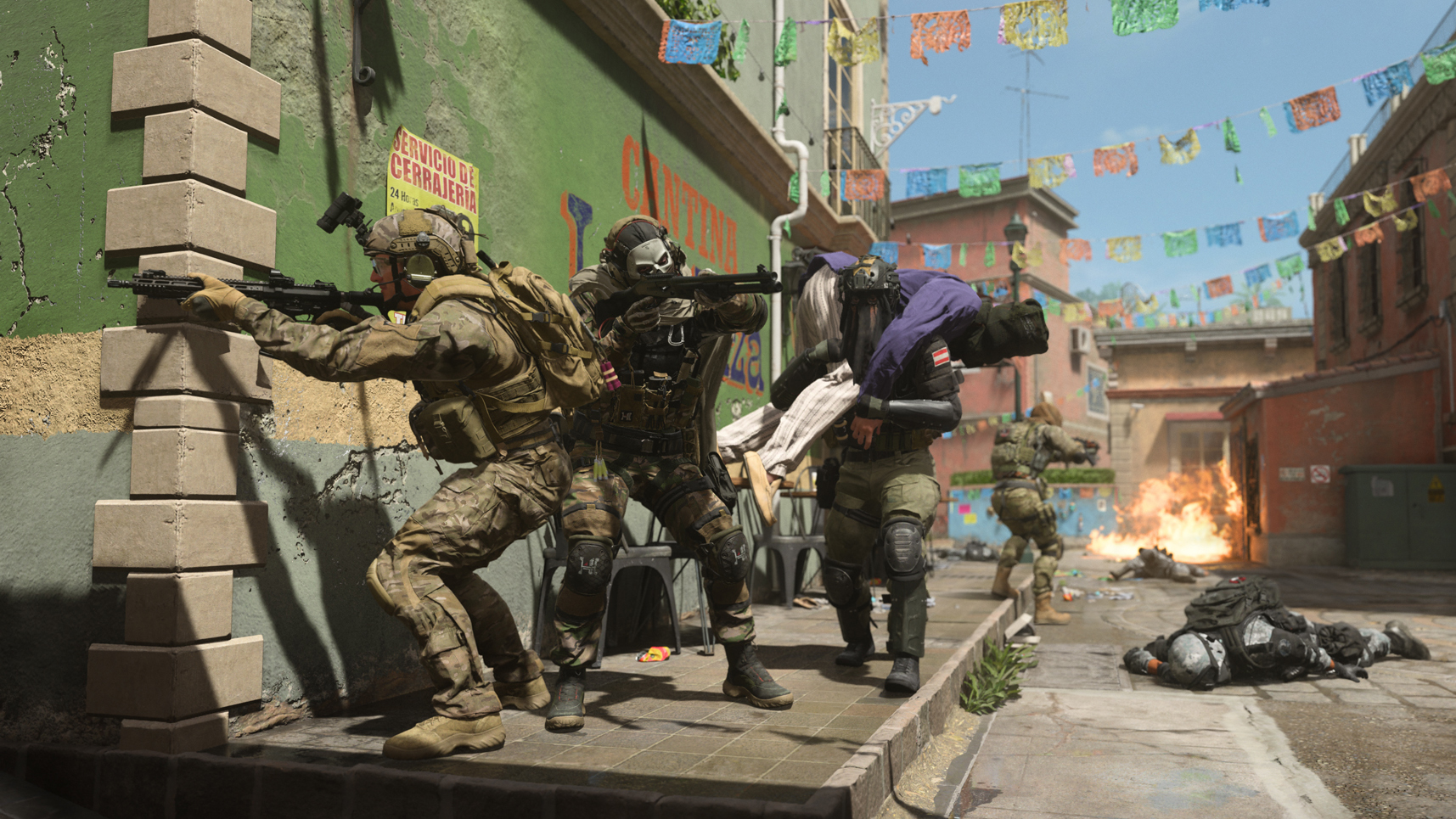
Call of Duty: Modern Warfare 2 is, for the most part, a pretty solid game. The guns feel good, the multiplayer is lively, and the Geneva Convention violations are rendered in eye-popping 4K HDR. But players still have a few complaints: not least of which is the game’s weird, almost iPad-like UI design for its menus.
In fact, players in MW2 have gotten so tired of navigating the game’s various interfaces that they’ve started feverishly imagining new ones. Players are taking on the camo menu, the create a class UI, and the main menu. But my favourite—originally spotted by GamesRadar—is this one from Reddit user InterventX. Like da Vinci at his drawing board, InterventX has imagineered an alternative UI for MW2 that trades out the labyrinth of big, touchscreen-esque buttons for a sleek, efficient, and parseable menu system.
this_is_what_i_wish_the_ui_would_look_like_made from r/ModernWarfareII
The concept chucks out MW2’s current motley of variants for a cut-down and readable set of options. In place of the cascading system of filters and Netflix-style carousels, you just have familiar and simple options that even the COD-averse could easily grasp.
It’s so immensely preferable to the current UI—and so remarkably similar to the UI already present in COD: Warzone—that it’s a real mystery as to why Infinity Ward took such a hard left-turn with the real UI design in MW2. Perhaps the studio will respond to the outcry that MW2’s UI has generated and tidy things up a little.
MW2 has been making big waves since it released a little under a week ago. Players have already come up with cunning exploits to amass mountains of XP, there’s a fast-developing meta surrounding the optimal number of gun attachments, and one player was so incensed by a ban that he turned up at Activision’s offices to “speak to an employee,” which is wildly out of line.


