An oral history of DreamForge’s 1998 adventure hit Sanitarium.
As was the case for a lot of ’90s adventure games, the small team at DreamForge making point-and-click horror adventure Sanitarium had mostly no idea what they were doing.
Most of them were fresh art school grads, and studio leadership was only a little older. When the game debuted in 1998, the narrative-driven horror market was already filled with Gabriel Knight: Sins of the Fathers, Phantasmagoria, and The 7th Guest. Sanitarium was a little different. It was still within the familiar, tried-and-true adventure genre that DreamForge already had experience working in (Veil of Darkness had been first other big horror hit), but with a psychological peg.
I made so many dreadful mistakes it’s truly a miracle the game made it across the finish line
Mike Nicholson
Sanitarium was one of the first point-and-click adventures I’d played that felt like a natural extension of ’80s and early ’90s pop culture—a real product of its time that paid homage to everything from classic science fiction to old Zippy the Pinhead comics.
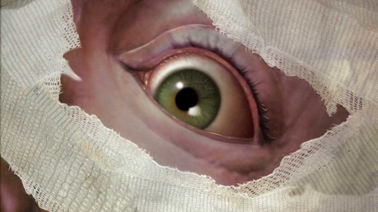
The journey begins with a jarring opening cinematic of a man in a terrifying car accident (it was originally synced to Metallica’s “Welcome Home (Sanitarium)” in hopes that the team could get the rights to the song, which very sadly didn’t happen). Max wakes up in the sanitarium—a distinctive, labyrinthine round tower that drew me in the second I started playing—with his head wrapped in bandages. He has no idea who he is, and after yet another accident, finds himself tumbling down a rabbit hole of fantastical “episodes” or realms where he must struggle to make sense of his identity, his trauma, and figure out how to escape.
The problem is, Max isn’t quite sure what’s real, and what isn’t.
After the game shipped, a new DreamForge staffer approached writer/artist/designer Mike Nicholson to tell him how much they appreciated the circular room design and its relationship to psychological theory. “As much as I wanted to accept the compliment, unfortunately, I had to explain that the only reason why the opening area was circular was that when we first started to design the space, it was rectangular,” says Nicholson. “Our boss saw it and said the square play space looks too antiquated/traditional to isometric adventure games. To placate him I redesigned the area to be a big circle instead.”
According to Nicholson, Sanitarium was truly a case of a bunch of young devs with little-to-no experience determined to make a fun game that they wanted to play themselves. Back then there weren’t really standard playtesting practices, so they also relied on each other to fine-tune the game.
“My entry into game development was a case of being in the right place at the right time,” says Nicholson, who, in 1994, was working at a small ad agency in Pittsburgh. While job-hunting in the classifieds, his then-girlfriend spotted an ad from a local computer game developer. “They were looking for a fantasy artist to make video game art. No experience necessary,” he says. “I went to the interview with my sketchbook and a lot of enthusiasm. Thankfully that was enough back then for me to get my foot in the door. It felt like I had found a winning lottery ticket, and in many ways, I still feel like I did.”
Meeting after work hours, the fledgling Sanitarium team discussed shared interests to figure out what kind of game they wanted to make. They loved the “episodic and wildly creative aspects of the classic Twilight Zone” and “creepy movies like Jacob’s Ladder.” Eventually they landed on the idea of a hub-based narrative so they could really branch out with the themes and locations.
And branch out they did—my favorite chapter of the game was The Hive, an far-future alien landscape full of fleshy organic gristle and insectoid cybernetics (where there are bugs, of course, there is also the obligate Starship Troopers quote). There’s an almost claymation-style quality to the characters here, with one of the most gorgeous puzzles adventure gaming has ever seen. It began as one of Nicholson’s ink drawings before the art team translated it into 3D. “I wanted to design a puzzle that fits into the area, and I was fond of the idea of having light pass through the insect wings to reveal patterns,” he says.
Dreamforge at the time was in the town of Jeanette, Pennsylvania, just outside Pittsburgh, home to a well-known glass factory whose abandoned ruins became a driving inspiration behind some of the game’s scenes. The fictional decaying town full of mutant children is named Genet, which sounds almost biblical. In Nicholson’s words, Jeannette was a “depressed small town” with the enormous ruined specter of the Jeannette Glass Factory looming over it—a mood that also affected the team’s work commute.
(Image credit: Mike Nicholson)
(Image credit: Mike Nicholson)
(Image credit: Mike Nicholson)
(Image credit: Mike Nicholson)
(Image credit: Mike Nicholson)
On one of his dark drives home, Nicholson finally came up with the cross-section dollhouse diorama concept for the Mansion chapter of the game—a chapter that got one of the devs, someone Nicholson considered a stoic sort of fellow, teary-eyed and choked up.
“Inspiration can hit at any time I suppose, and for reasons I honestly can’t recall, it was that late evening drive that did it,” he says. “The next day I brought the idea to the team, and they loved it with almost no changes to the idea. It’s been my experience in game development that this situation doesn’t happen very often and that’s probably why I still remember it to this day.”
At one point the feedback we received was that players wouldn’t be able to identify with the main character of Max because his head was wrapped in bandages
Mike Nicholson
Sanitarium doesn’t consistently hit those highs; it isn’t exactly a bastion of realism when it comes to ancient Aztec culture and some of the finer points of mental health. The games industry of 1998 was still relatively fresh and experimenting with evolving visual technology, evolving practices, and storytelling methods. All of this makes Sanitarium a genuinely engaging time capsule of the very distinct cluster of interests and influences that went into it.
“Our research was, to put it plainly—fairly shallow,” Nicholson admits with a laugh. He also remembers the difficulty of finding a publisher who was open to having what was essentially a “faceless” protagonist. “At one point the feedback we received was that players wouldn’t be able to identify with the main character of Max because his head was wrapped in bandages and they suggested we remove them. Considering the story and the huge reveal at the end of the game with Max’s bandages coming off, you can imagine our response to that.”
When I ask Nicholson about what he could have done differently, the first thing he says is that he would have gotten himself some real management training. “I made so many dreadful mistakes it’s truly a miracle the game made it across the finish line,” he says. “I benefited from an otherworldly and arguably undeserved amount of patience from my team and studio leadership, and for that, I will be eternally grateful.”
(Image credit: DreamForge)
(Image credit: DreamForge)
(Image credit: DreamForge)
On the creative side of things, he would’ve liked to go deeper.
“My design sense was based almost entirely on my life experiences up to that point, and at age 28 when we started, it was admittedly not all that much,” he says. “Were Sanitarium to be designed today I’d like to think narratively it would have a broader scope and more depth to the characterization.” Nicholson went on to focus on UI/UX work—he spent 14 years at Blizzard working on the Diablo 3 UI and art for other games. He still keeps up to date with adventure games.
“I enjoyed the narrative design and presentation of games such as The Vanishing of Ethan Carter and What Remains of Edith Finch,” he says. “If we were ever afforded the opportunity to pursue a sequel to Sanitarium, I’d like to think it would take a similar approach.” In the meantime, Sanitarium exists as an unparalleled example of late ’90s game art that wasn’t afraid to get weird and raise the aesthetic bar for the adventure genre as a whole.
The Hive scene where antagonist Gromna is giving a “televised” speech, complete with fascist rally footage flanking a giant, semi-translucent wasp torso, is the good stuff.
In the town of Genet, each mutant child’s portrait was a labor of love.
And those writhing maggot beds. The fleshy door-lock puzzle studded with clear mucus pods.
Revisiting this strange, messy realm—almost a visual anthology with the way you move through different themes and styles—is a breath of refreshingly putrid air, and if you too have never felt like photorealism was the path to better game worlds, it’s well worth remembering.


